Business objective
Since its 2021 launch, the Learning Tool has become one of Connect's most-used tools, with over 200,000 monthly visits.
Despite introducing Timeline notifications for time-sensitive information, engagement was low, with only 60-80 card tabs per month.
When the Connect team started designing the Widget framework, we aimed to be among the first to display time-sensitive learning content.
timeline
1 months
role
UX/UI designer
tools
Figma, Teams, Jira
Outcomes
+30%
Increase in app interaction with
learning content
90%
Employees found the widget valuable
01
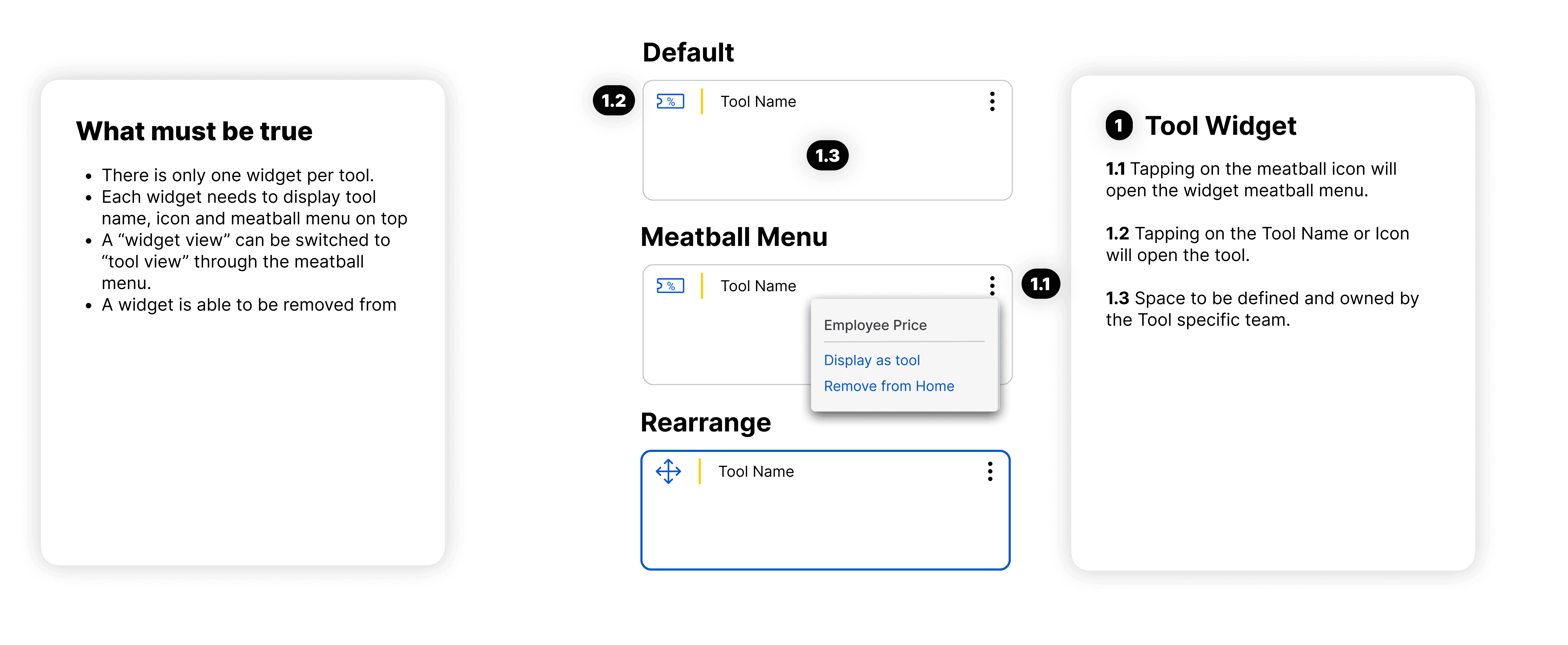
Widget Framework
Defined by the Connect design team in collaboration with tool teams to ensure the widget designs maintain consistency and a unified form.
02
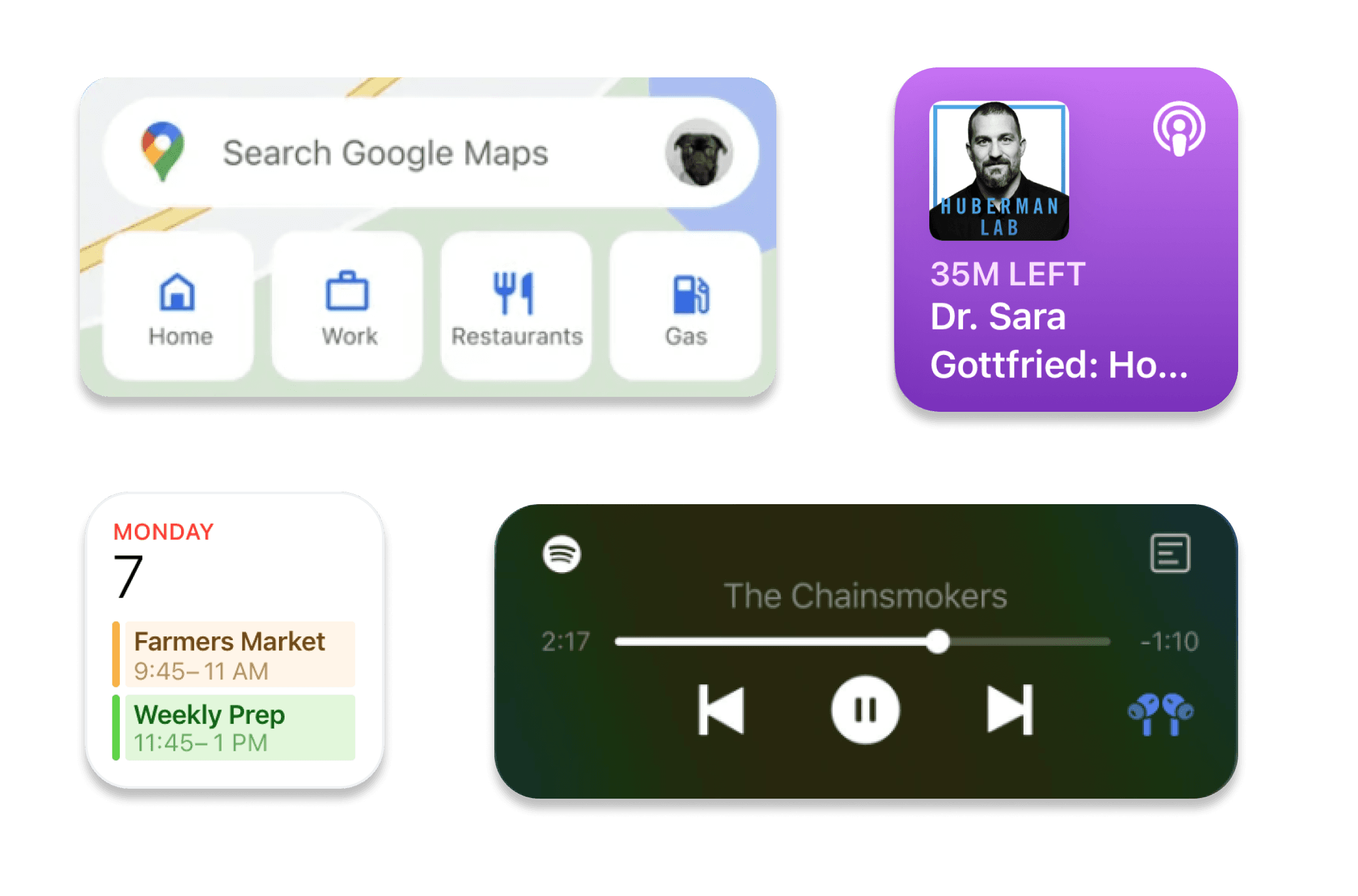
Competitive Analysis
What makes me, as a user, want to engage with these widgets?
PERSONALIZED content
DYNAMIC information
ACTIONABLE display
CLEAR presentation
03
Ideation
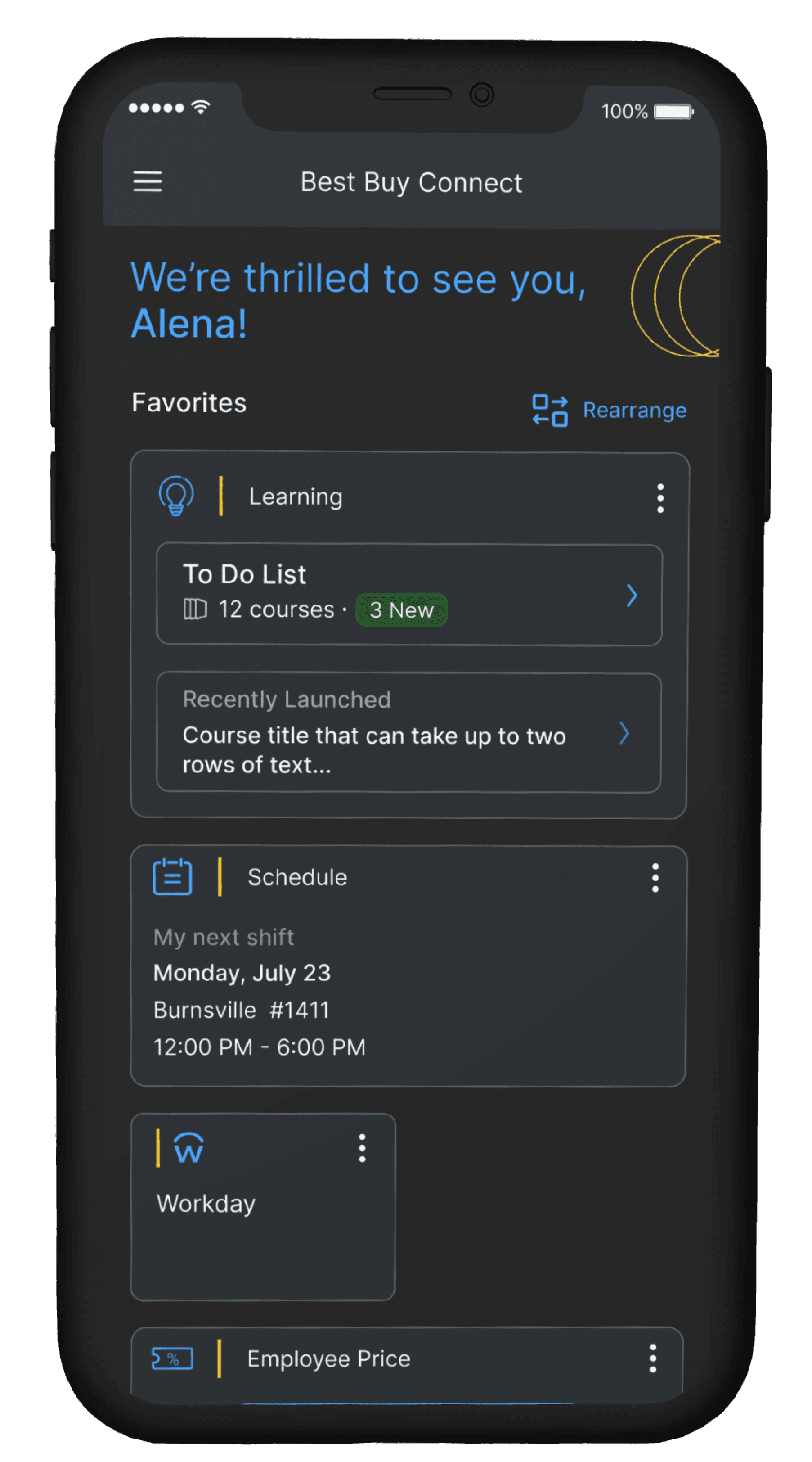
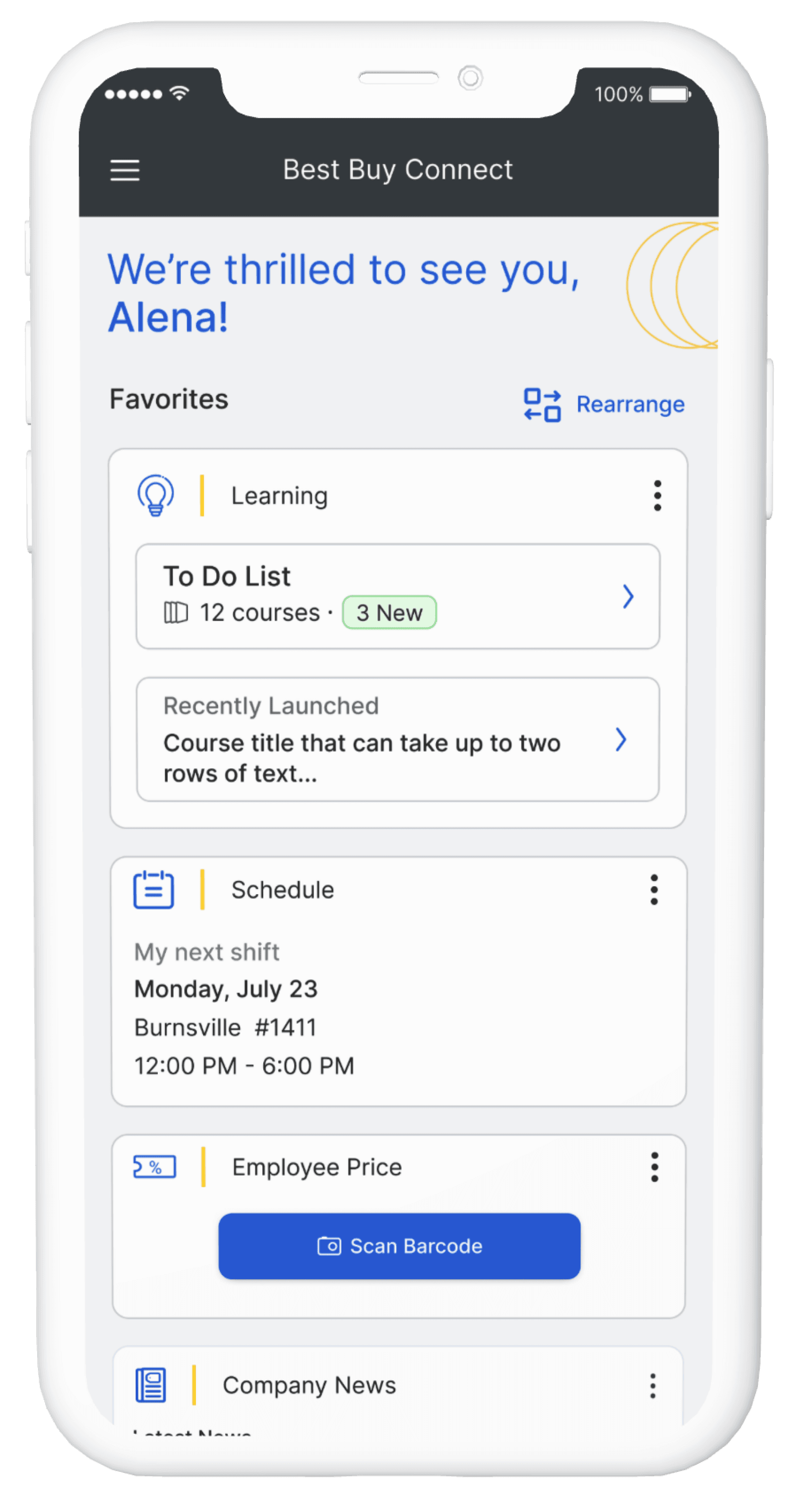
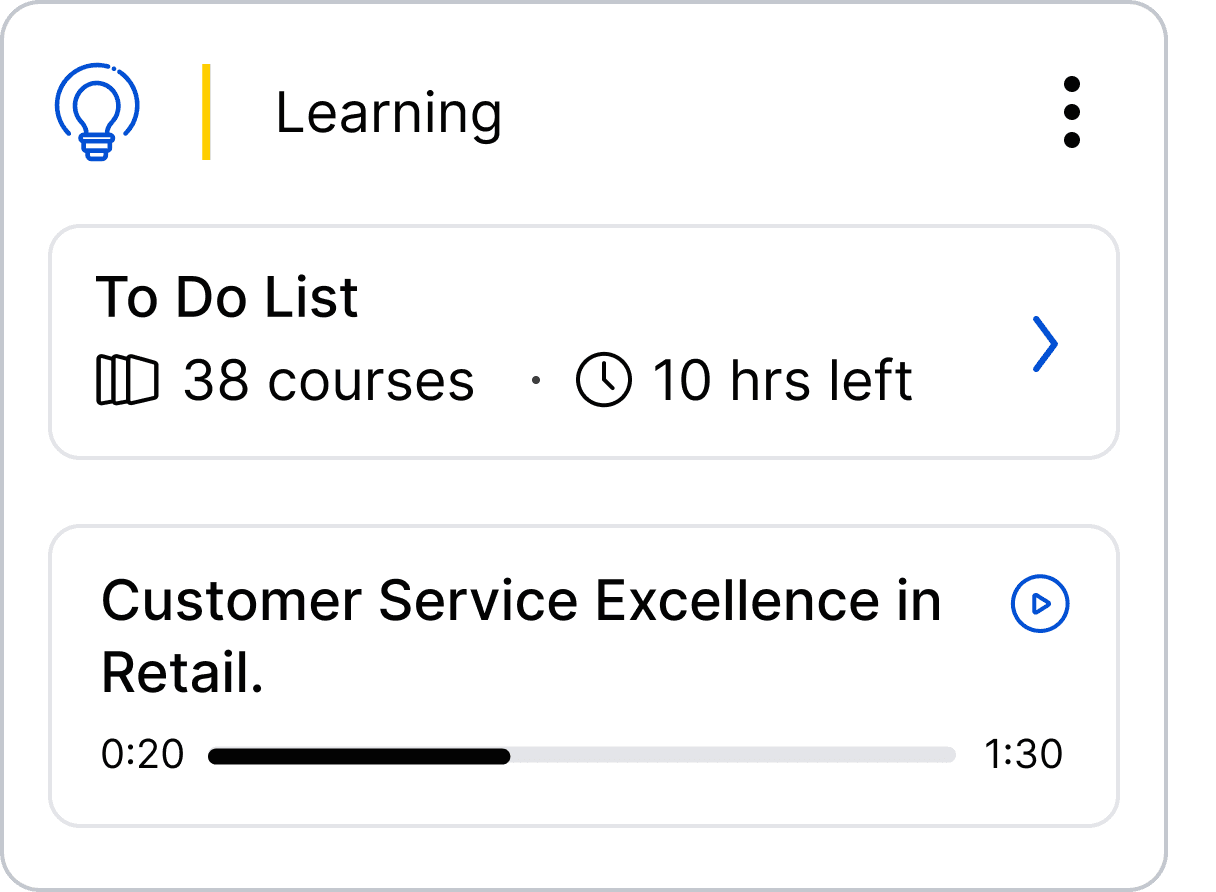
Determined what to display in the widget based on the tool's content. What do employees need quick access to?
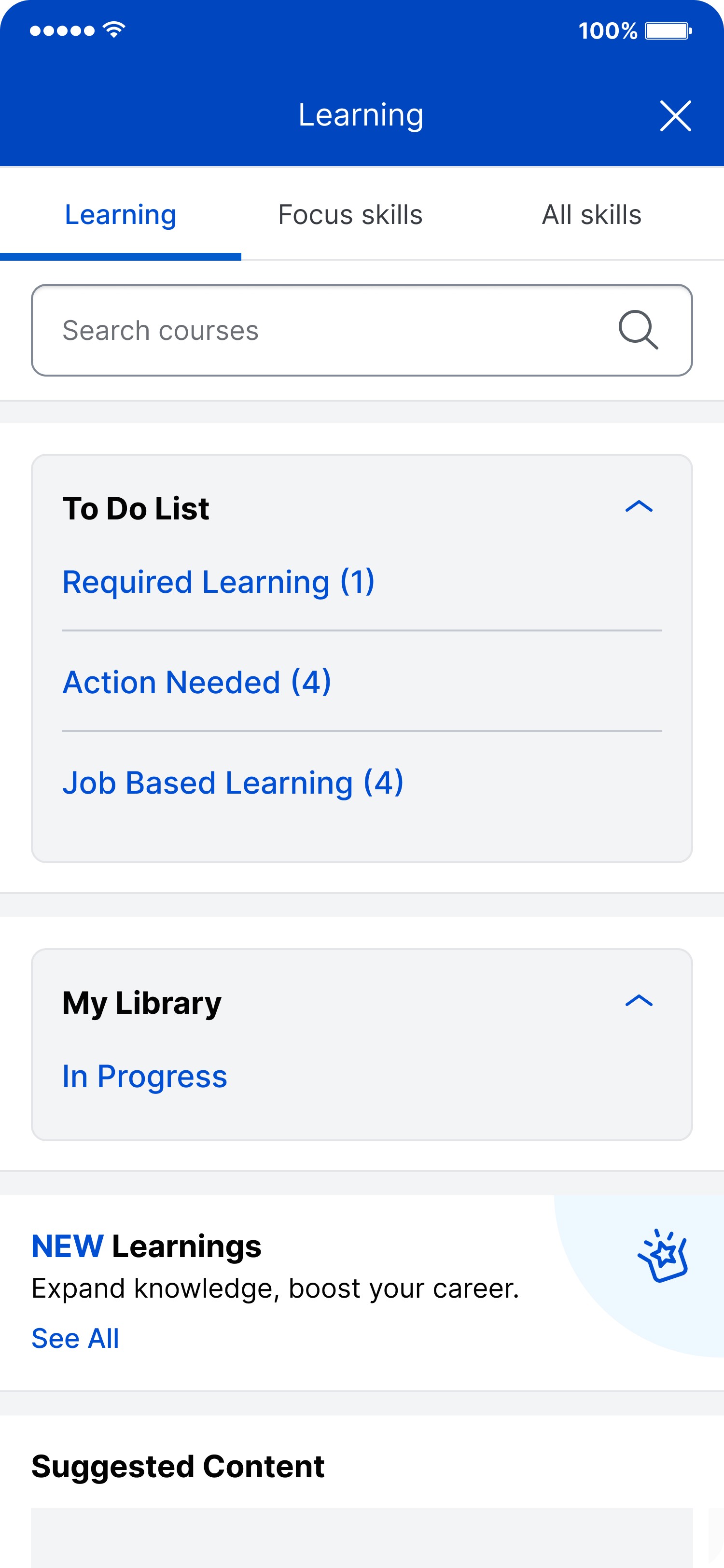
To-Do List
dynamic & personalized cards
In Progress Course
dynamic & personalized cards
CTAs | deep links
learning search
in progress courses
focus skills
04
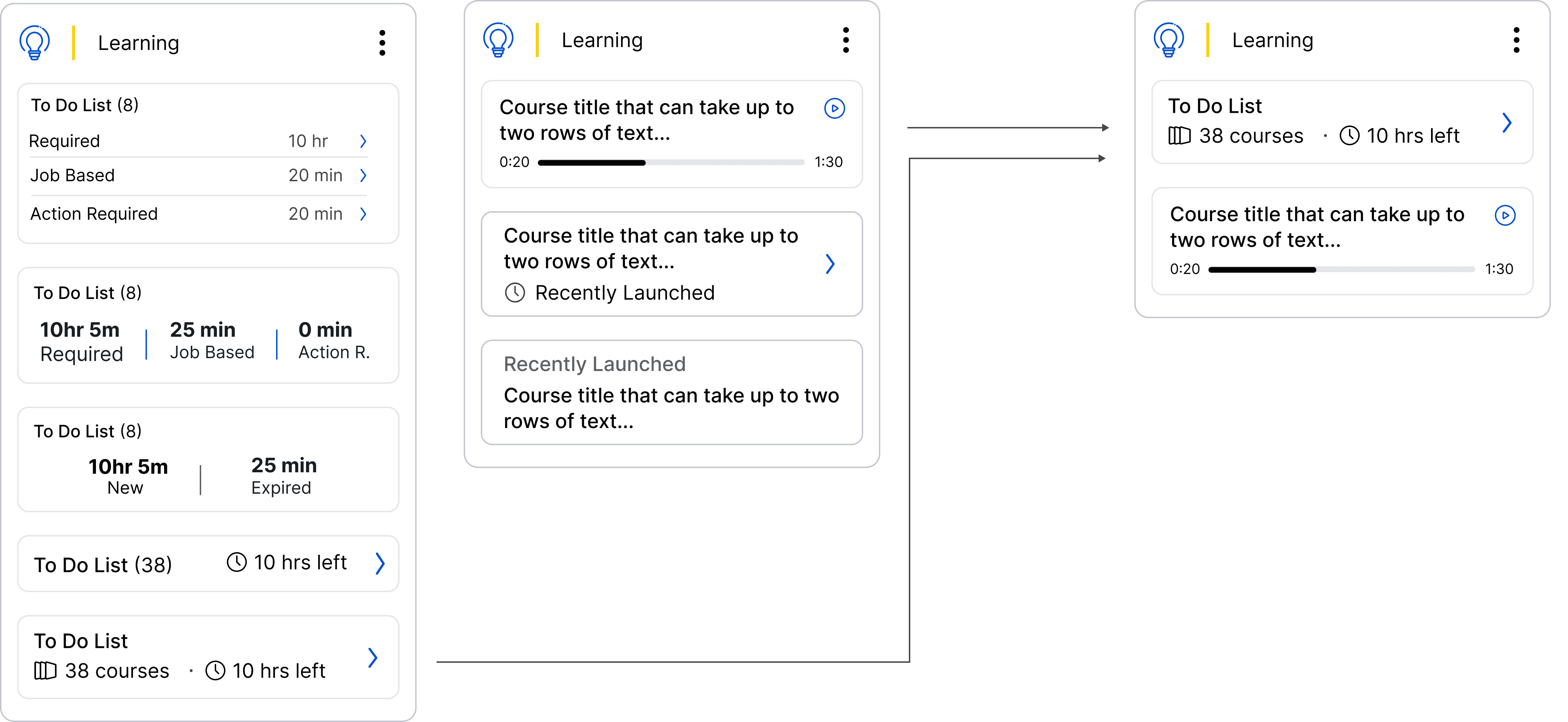
Iterations
05
Validation
Widget personalization required backend work, the feasibility of which I needed to confirm with the engineering team.
❌ Not Able
Show time left to complete To Do List courses (missing APIs)
Display accurate In Progress time
✅ Able
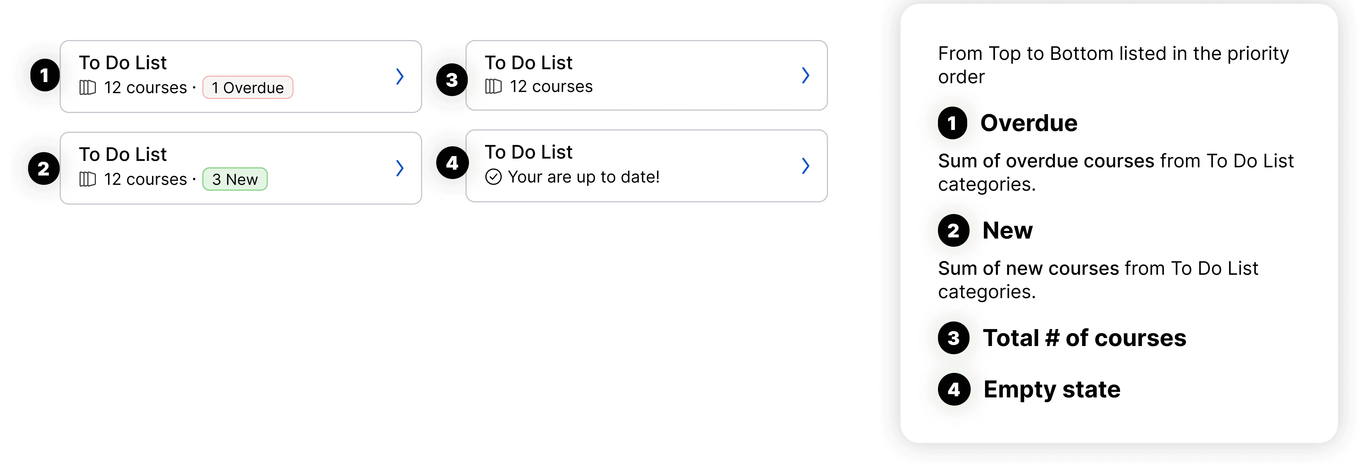
Remove tile in the empty state
Make content inside of the tile dynamic
⚠️️ Spike
Loading time
06
Documentation
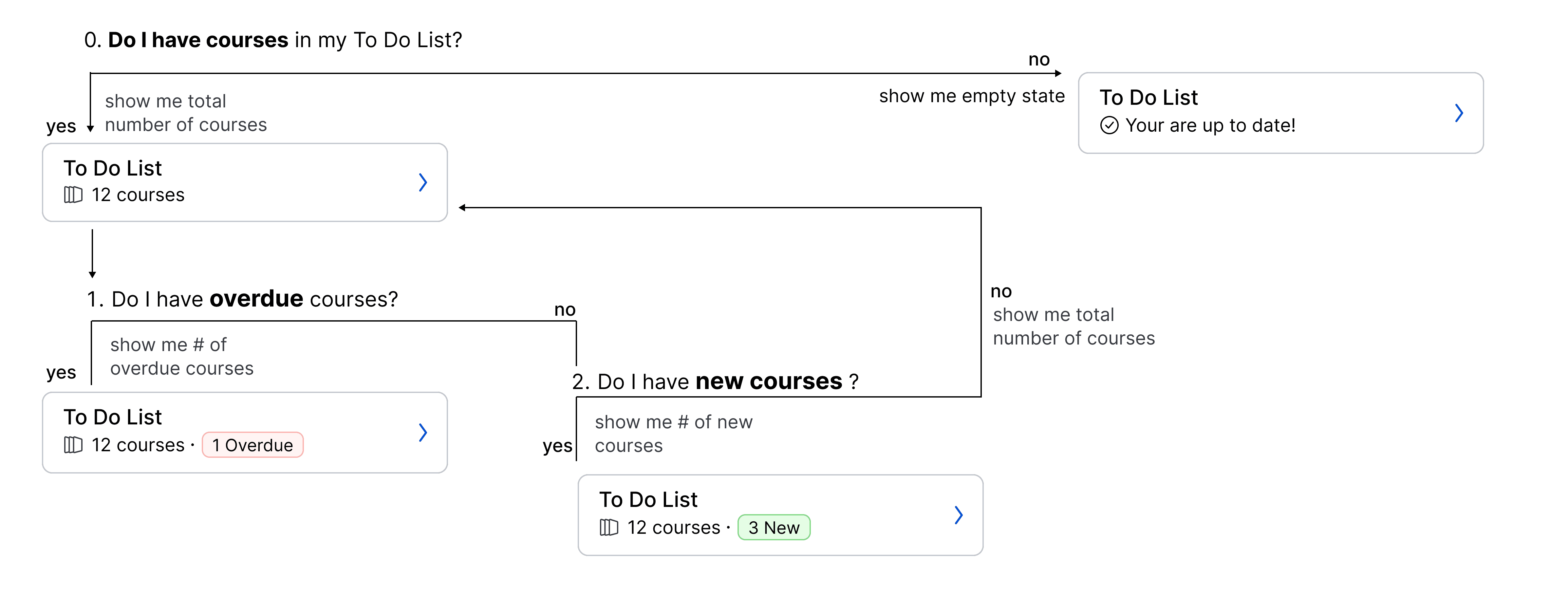
Personalized data based on the To-Do List state required additional documentation. With an offshore engineering team I needed to ensure the document was clear and precise

