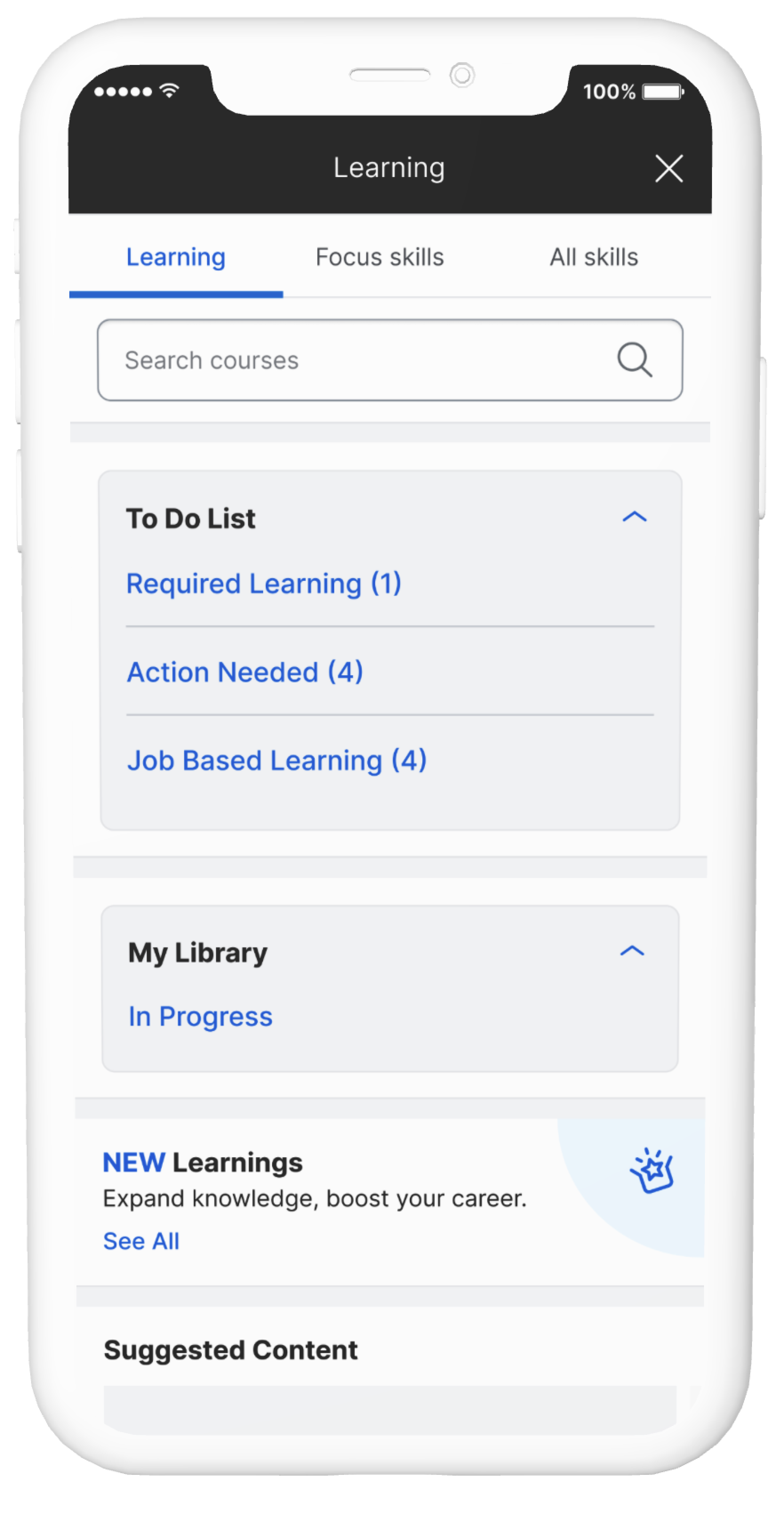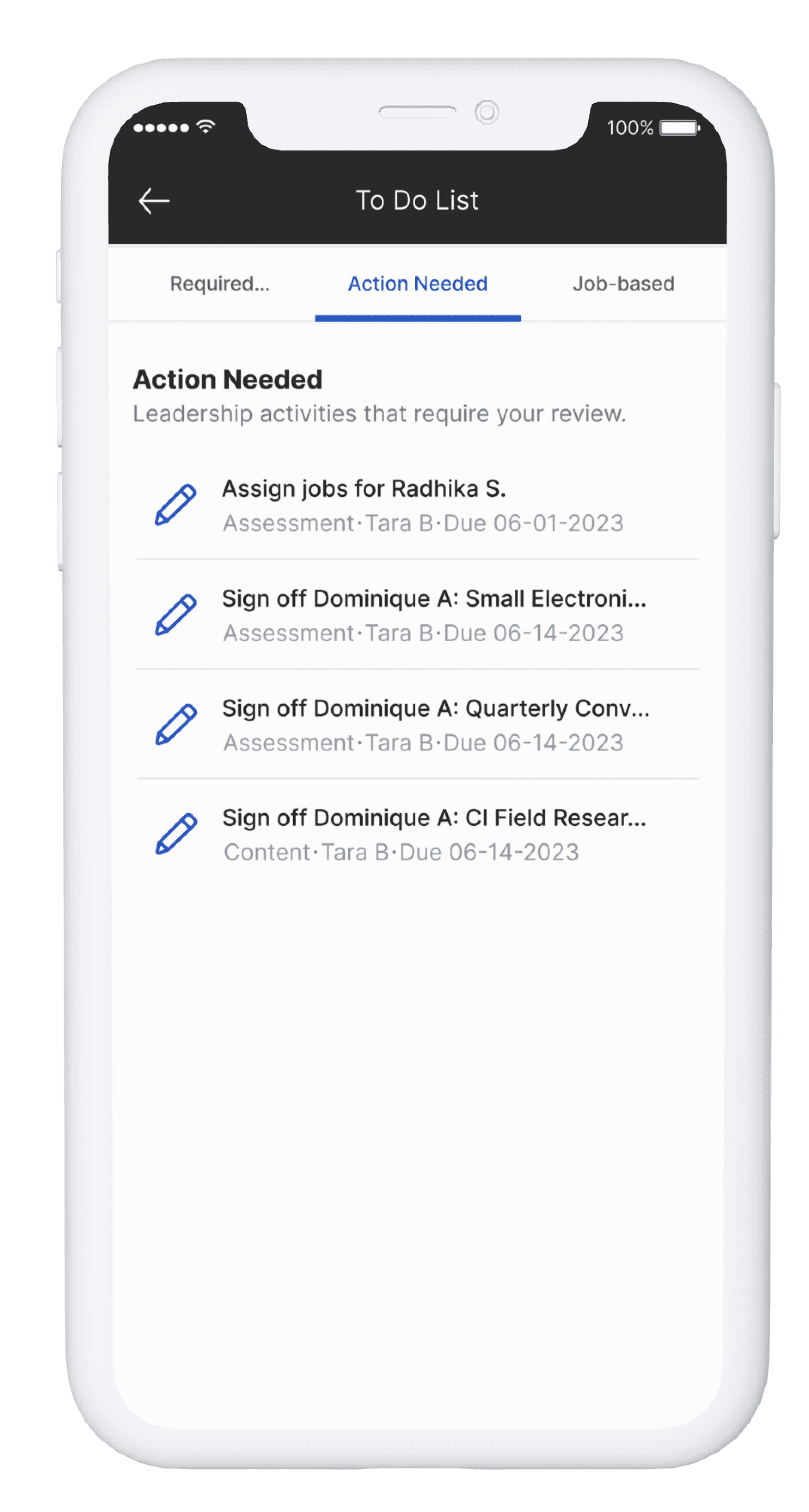
Problem
More than 67% of employees were unable to be scheduled for their jobs due to incomplete learning requirements they were unaware of.
Solution
Provide employees with a simple way to check and receive new required learnings.
timeline
6 months
role
UX/UI designer | Researcher
team
Product manager | 2 engineering teams
tools
Figma, Miro, Teams, Jira
Outcomes
01
Heuristic Analysis
How easy is it to prioritize the learnings?
Does the new terminology resonate with users?
How accessible is the mobile design?
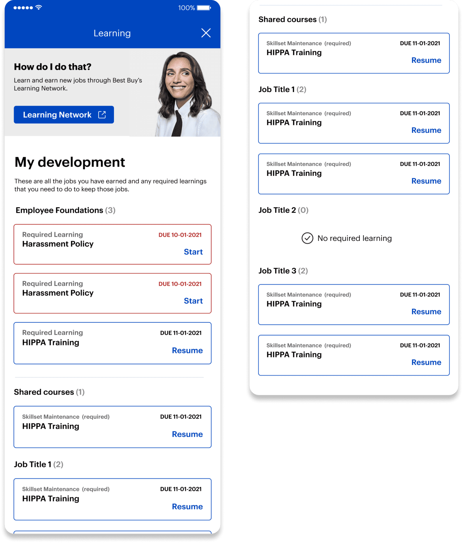
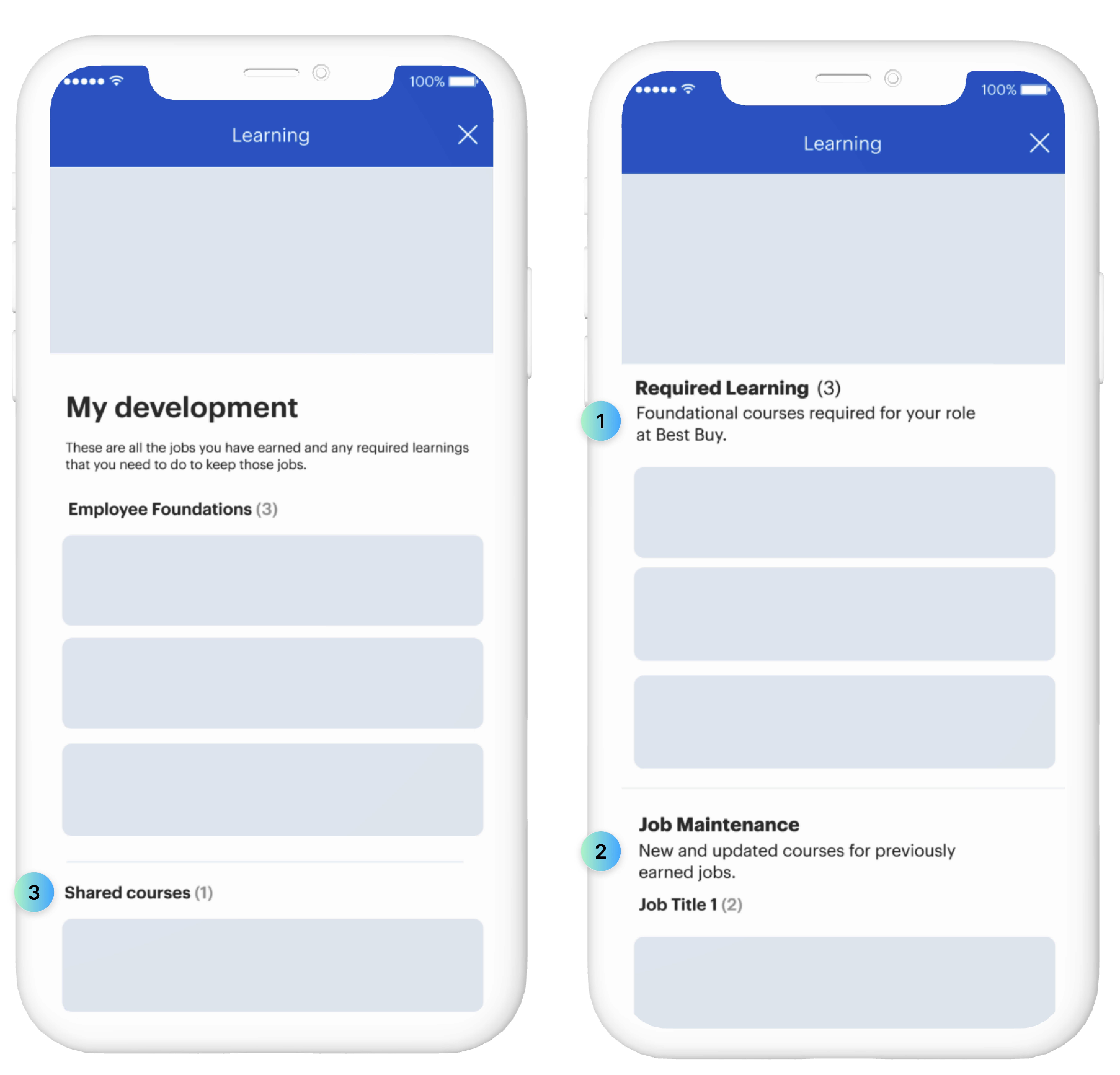
Do users understand what 'Shared courses' mean?


Consistency
Accessibility
Clarity
Efficiency of use
Minimalist Design
02
Stakeholders Interviews
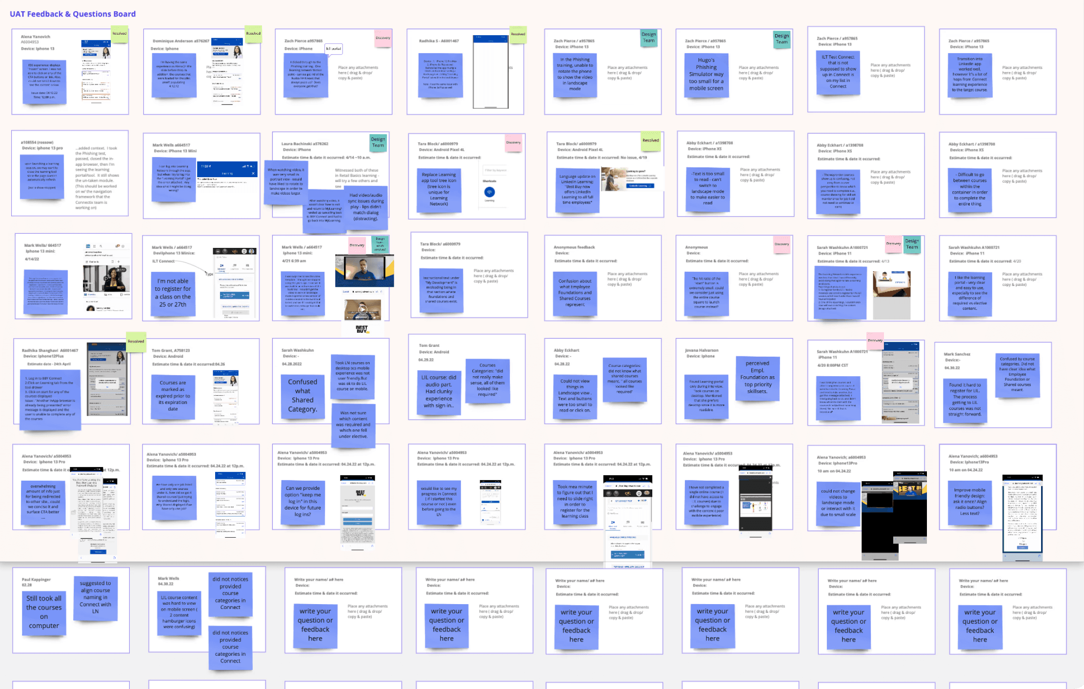
Since the project had not yet been released to BBY employees, I worked closely with the primary stakeholder group, who had access to a lower environment and possessed extensive product knowledge.
Findings
Unclear terminology
Poor readability
Preference to desktop experience
Over cluttered desktop To Do List
03
Updated Project Timeline
After presenting the discovery findings to the product and engineering teams, we agreed that the experience in the third-party app needed improvement and the project scope required expansion.
04
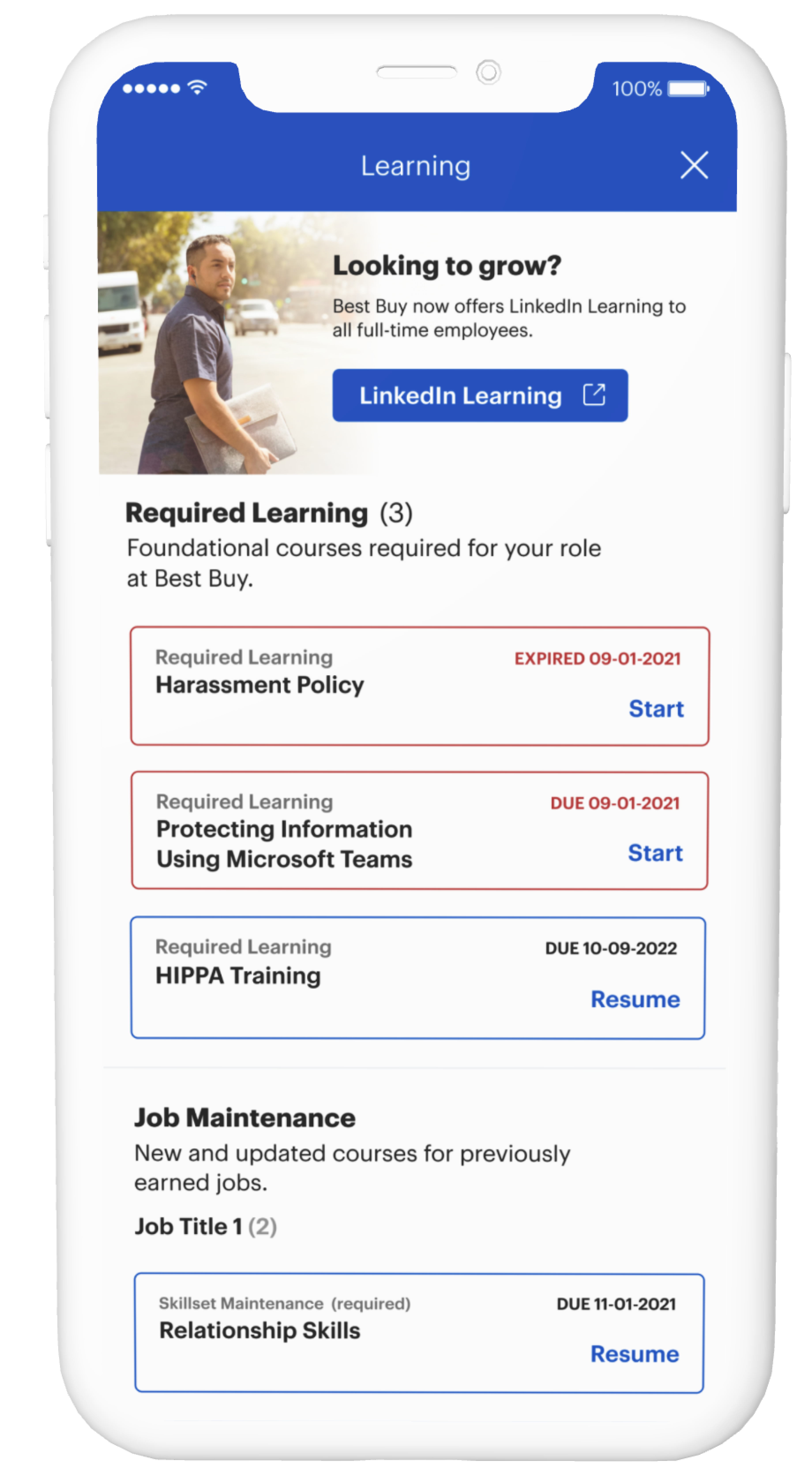
Mobile Design Enhancement
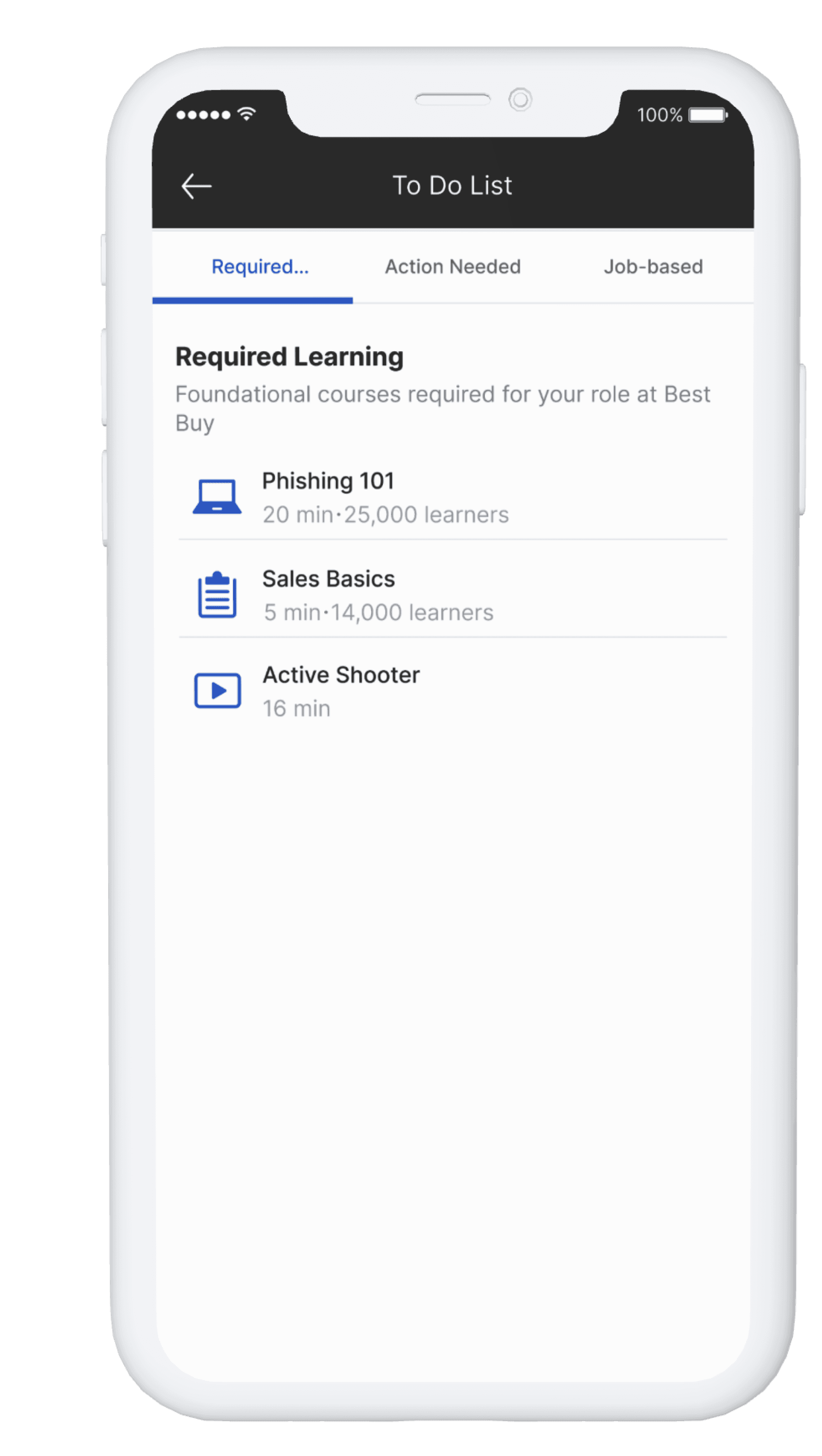
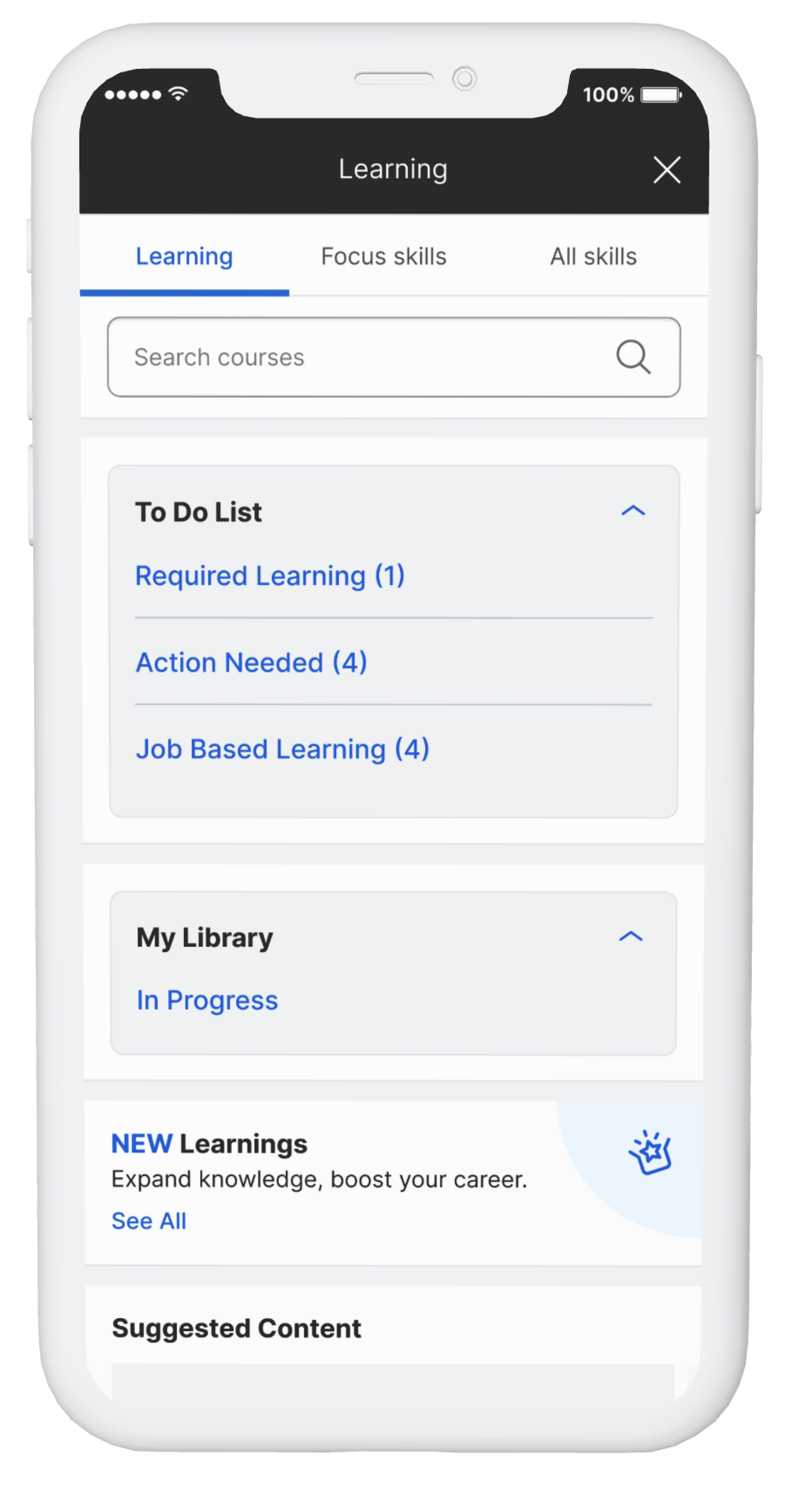
As we decided to move forward with the launch of the mobile experience, I made minor design enhancements based on research feedback.
Reintroduce familiar terminology
Increased text size from 12 to 14px
Removed the "Shared course" section which users found confusing
05
Desktop To-Do List Discovery
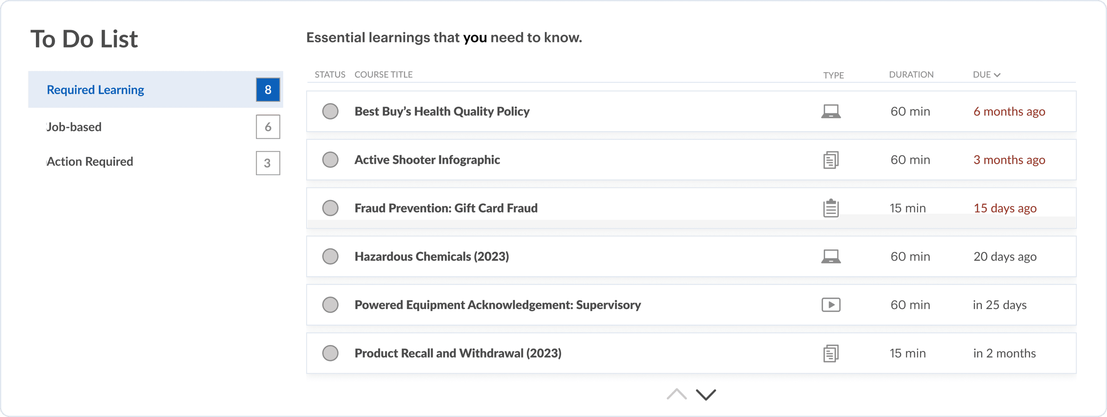
To better understand the challenges with the existing To-Do List without spending additional time, I conducted a few ad hoc interviews and collected the data.
06
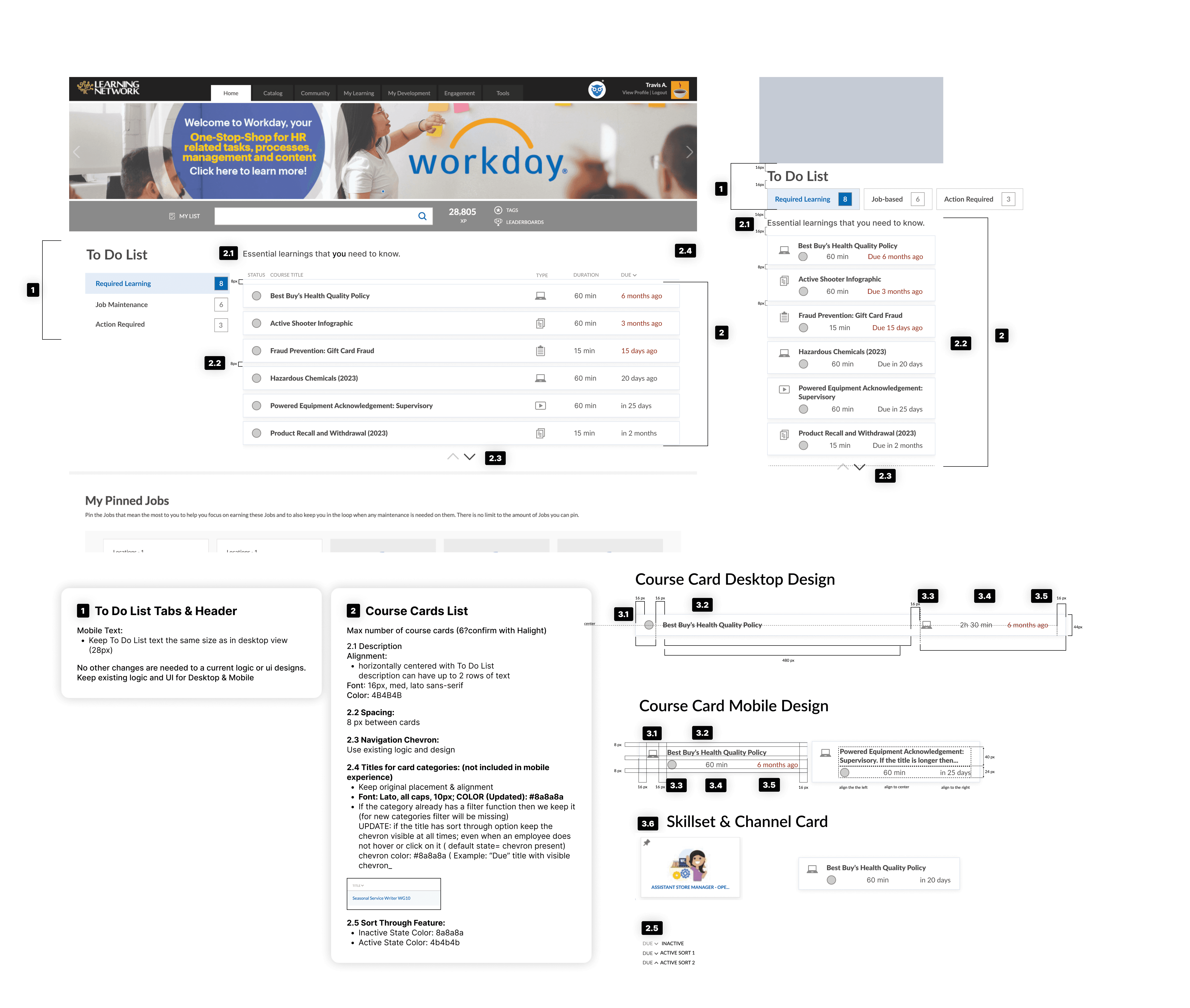
Desktop Design Iterations
07
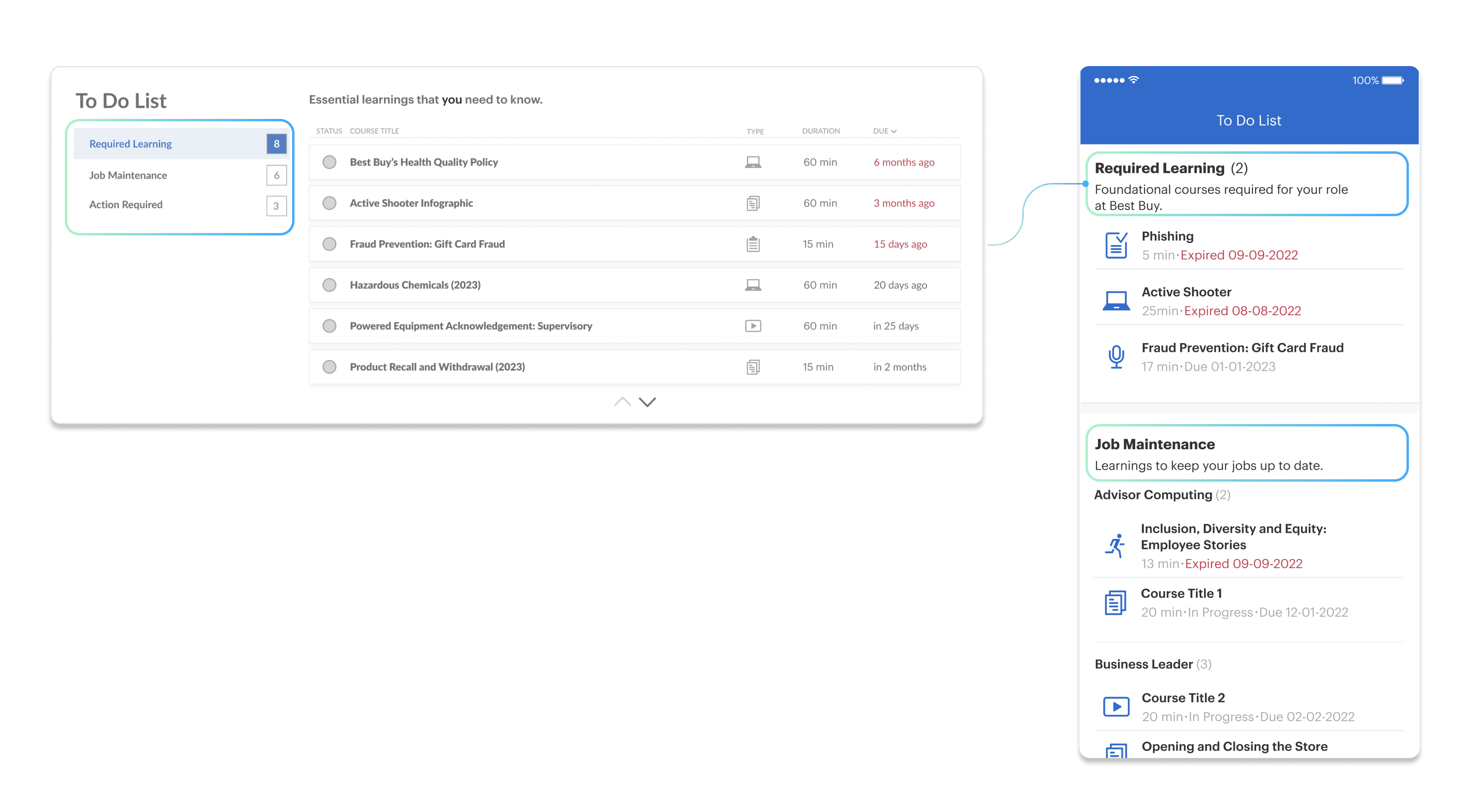
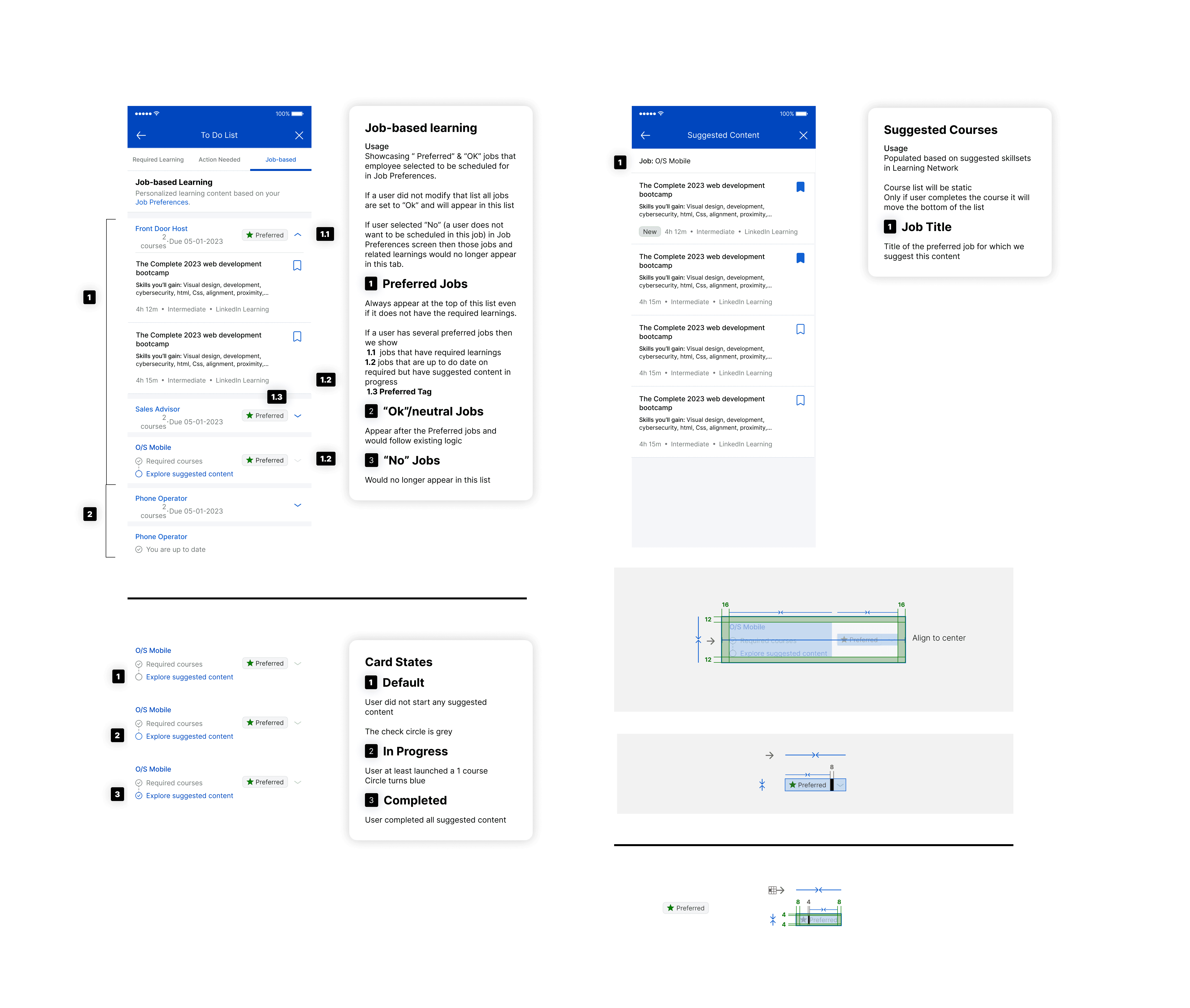
Mobile-Desktop Design Consistency
Providing consistency in what and how learning content displayed in both experiences.
08
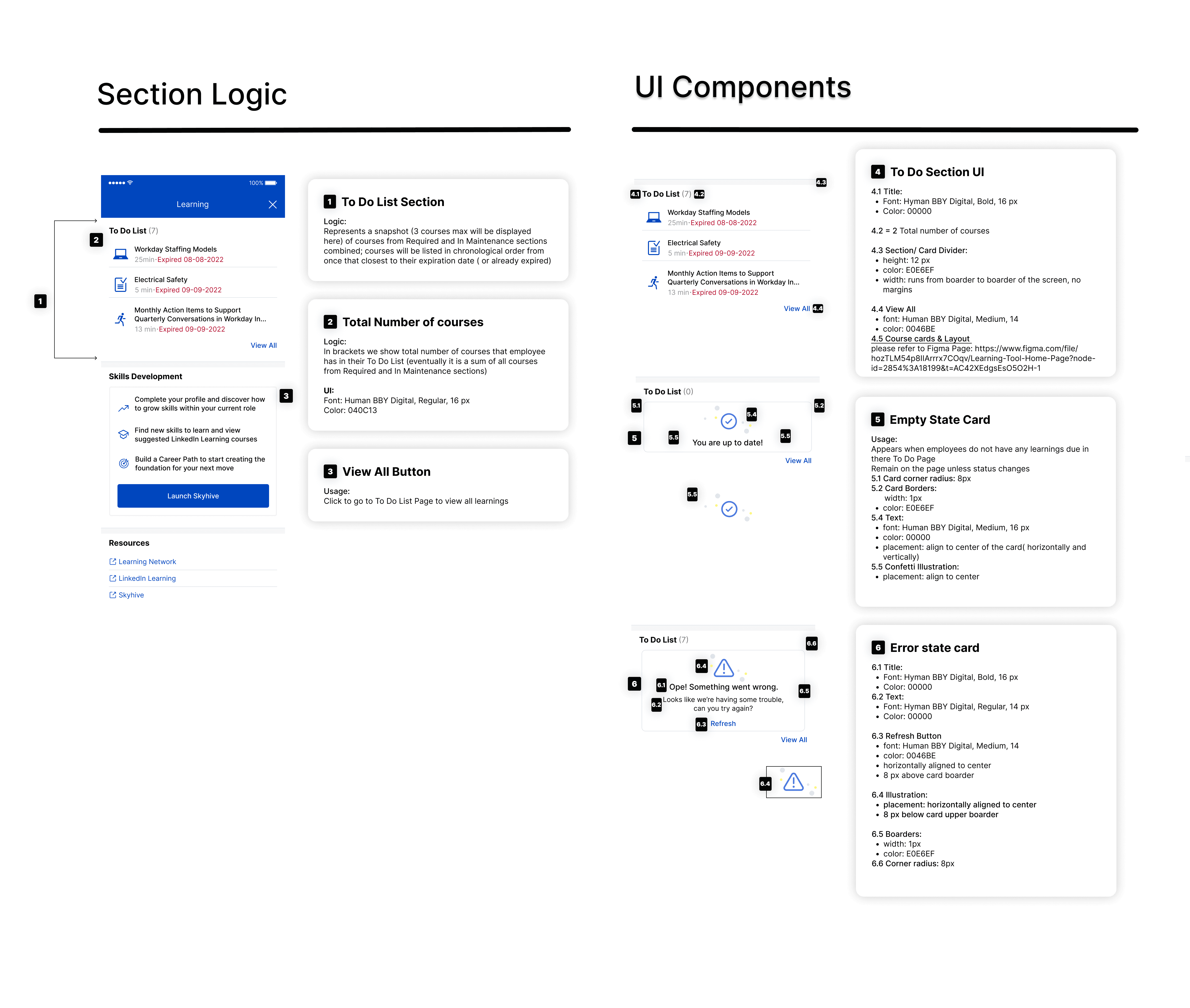
Deliverables & Documentation
09
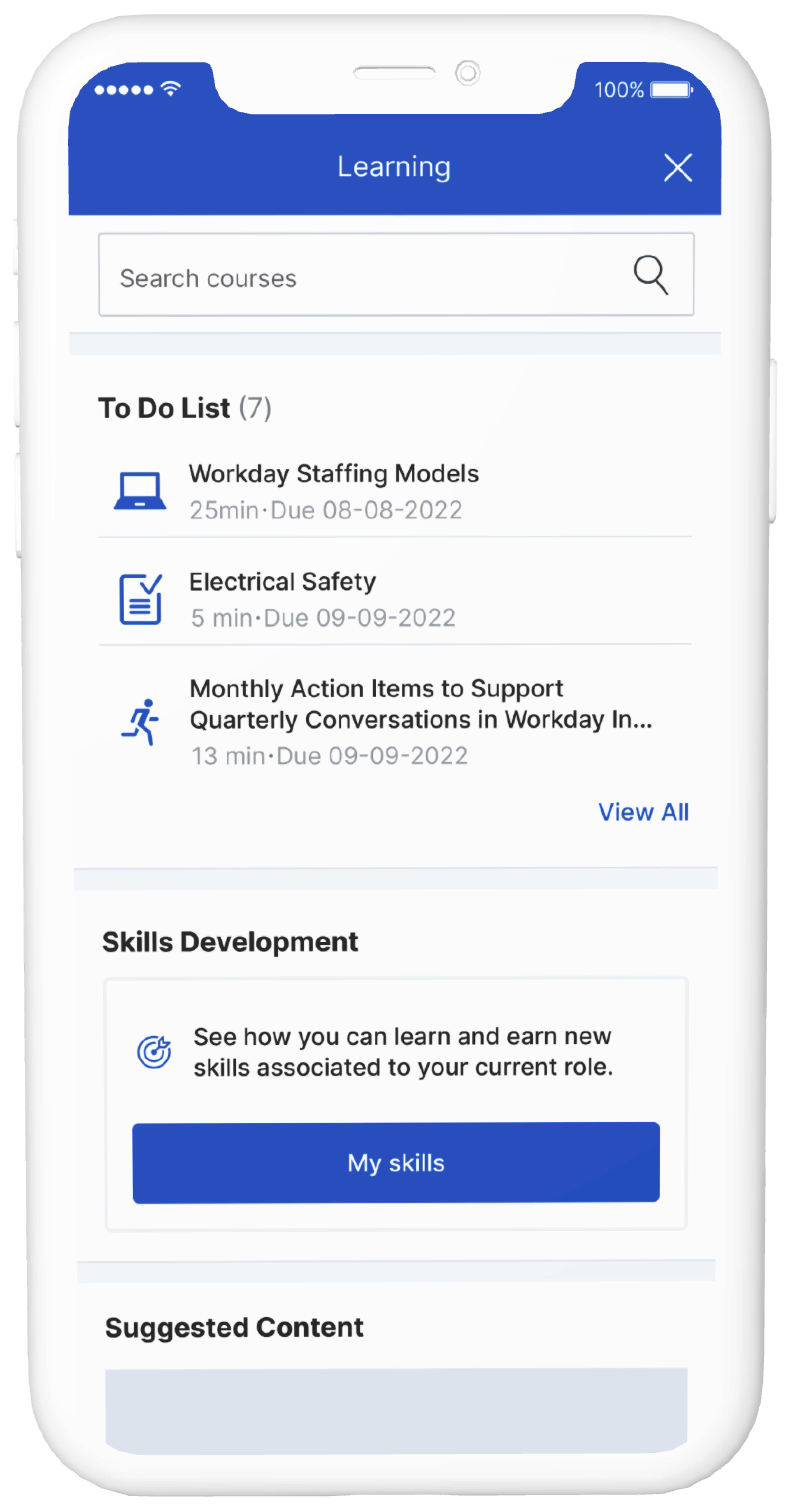
Followed Iterations
As the learning tool evolved, we needed to create a more concise preview of the To-Do List and improve the scannability of courses.
